Chicago Migrahack was held from May 31 – June 2, 2013 as a part of the National Day of Civic Hacking. I helped judge the hacktahon. Following is my take on the projects, including notes, screenshots, and images from the day. Here is a copy of the spreadsheet the organizers used to manage the projects, here’s the project page on the Migrahack website, and here’s a bunch of photos I took at the event.
The projects are listed in the order in which they were presented. The descriptions include any award the entry won and the commendation presented by the judges for any award.
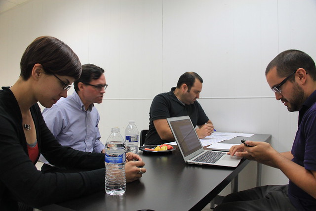
Judges!
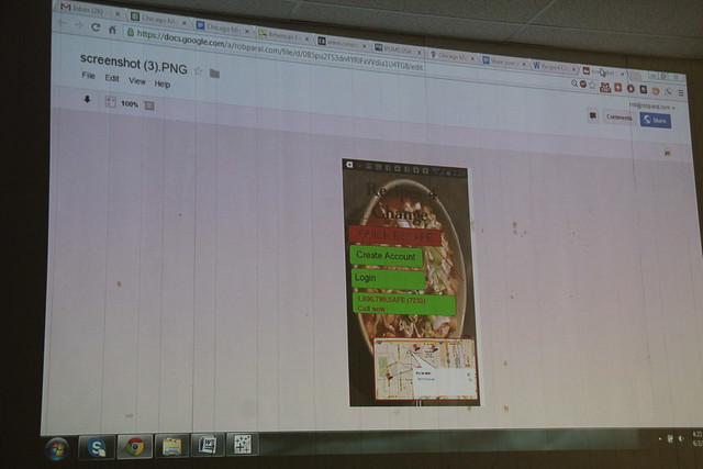
Recipes for Change
This was a concept for an app to help women build an underground support network. Domestic violence is a leading source of crime. It is under-reported, especially among those who are undocumented and/or are not native English speakers. They call it “recipes” and make it look like a normal recipe site. Dots on a map of women who can help them within a 5-mile radius.
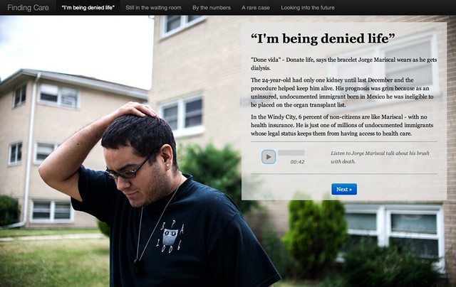
Finding Care
http://tarbell.recoveredfactory.net/findingcare/
By the Los Almighty Windy City Data Hustlers team of Lucio Villa, David Eads, Maria Ines Zamudio, Yana Kunichoff, and Willberto Morales
“I’m being denied life”, says the homepage of this is explainer of stories surrounding the Affordable Care Act. They looked into PUMS data and pulled out some “By the numbers” stuff. All of this is driven by the Tarbell template as well as javascript and jquery.
Finding Care won “Best storytelling with data visualization”. Here’s the text of the commendation made by the judges on this entry:
Coherent, elegant narrative with lots of points of departure. Triggers questions for further research. Polished production in short time frame with simple, effective data visualization. Would love to see calls to action– links to advocacy groups, reporting on pending legislation, and so on.
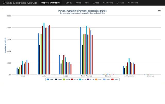
Chicago MigraHack Web App
http://www.20thirty.com/migra/
By Team DePaul (Paul Duszak, Temuulen Erdenekhuu, and Alex McCarten-Gibbs).
This team created a visualization of persons obtaining permanent resident status in the United States, broken down by region of origin. Mainly uses highcharts and other javascript. Allows the user to export all data.
Chicago MigraHack Web App won “2nd place data visualization team project”. Here’s the text of the commendation made by the judges on this entry:
Dead-simple visualization that takes a comprehensive look at a central dataset. Provides an understandable, useful, and portable tool for others to explore, understand, and share. Key insights into immigration.
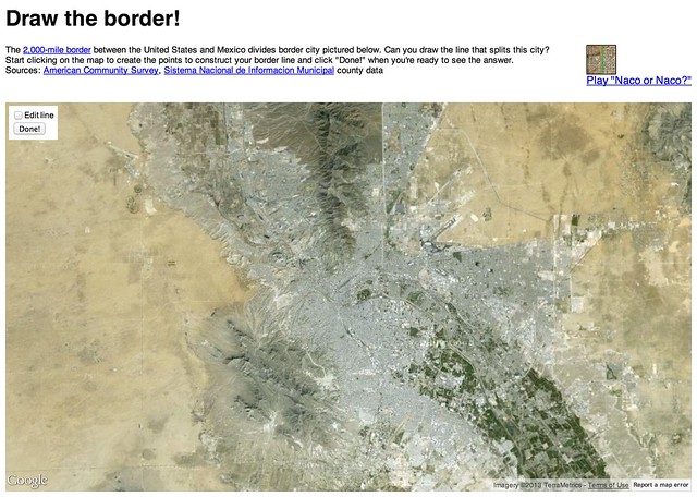
Draw The Border and Naco or Naco?
http://danhillreports.com/migrahack/
http://danhillreports.com/migrahack/naco.html
By Dan Hill
This person made two related entries, both of which play on geographic perception and reality.
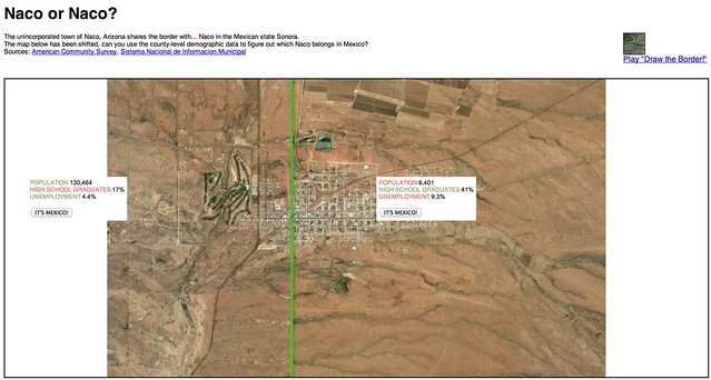
Draw the border! presents itself this way: 2,000-mile border between the United States and Mexico divides border city pictured below. Can you draw the line that splits this city? Start clicking on the map to create the points to construct your border line and click “Done!” to see the real border in green and learn about the cities on each side.
Draw the border won “Best insight team project”. Here’s the text of the commendation made by the judges on this entry:
Fun, intuitive tool that engages the user and challenges assumptions. Simple presentation that takes an current meme (GeoGuesser) and adds an education element. Extra points for individual creativity, persistence, and execution. Sometimes collaboration is all about just showing up.
Inspired by GeoGuesser, Naco or Naco? is a website that shows a satellite view of a place that contains the border between two cities and prompts the user to draw that border. Naco or Naco? shows Naco, a city that has a country as a border, and presents some basic demographic information as a clue.
Early Childhood Resource Need App
http://migrahackranch.weebly.com/
By Team RANCH (Norbert Winklareth, Carlos McReynolds, Heather Gerberich, Adriana Cardona-Maguigad, and Rebecca Harris)
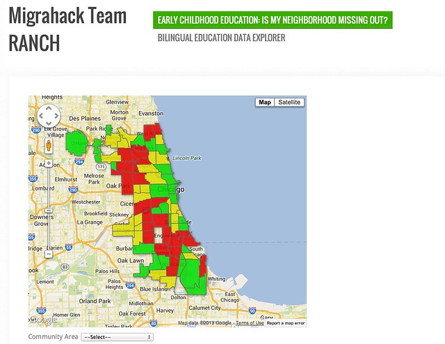
The Early Childhood Resource Need App is a map that shows neighborhoods in Chicago color-coded by their need for early childhood education seats, as calculated by the Illinois Facilities Fund, representing thousands of children unable to access preschool and child care programs.
Team Maginificent 7
Antonio Garcia III, Adam Pearce, Cindy Agustin, and Irene Tostados
Three Alarm Data Fire
No presentation
Kenneth Watkins, Oz du Soleil, Sachi Shirasaka
Illinois in the ICE age
http://geoff.terrorware.com/projects/migrahack/
By Ice Breakers (Geoffrey Hing, Tara Tidwell Cullen, Ruth Lopez, Jimmie Glover)
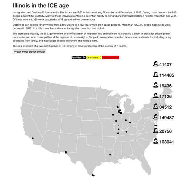
The Illinois in the Ice Age website is a snapshot of a two-month period of ICE activity in Illinois and a look at the journey of 7 people.
Immigration and Customs Enforcement in Illinois detained 966 individuals during November and December of 2012. During those two months, 915 people also left ICE custody. Many of these individuals entered a detention facility earlier and one individual had been held for more than one year. Of those who left, 390 were deported and 38 agreed to their own removal.
ICE Breakers won the “Best data visualization team project”. Here’s the text of the commendation made by the judges on this entry:
A complex analysis in an original presentation. Deep journalism that is ripe for further analysis and exploration. Contains a clear call to action for others to continuing the work; connecting the dots.
Immigration Recalibration of Suburban America
http://migrahack-dandelion.herokuapp.com/
By Dandelion Project (Lauren Pabst, Adriana Diaz, Antonio Oliva, Forrest Blount, Ravishankar Sivasubramaniam, Michael Drouet)
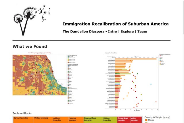
Immigration Recalibration of Suburban America focuses on the demographic changes in Niles and Lisle Townships. Nile, for instance, is attractive to a growing number of immigrants from Asia and the Middle East. Lisle has become increasingly Indian, Chinese and Mexican. The site offers maps, charts, and analyis of these trends.
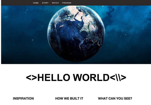
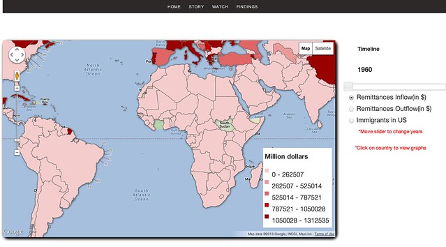
Team Hello World
http://prominent.mie.uic.edu/Project/index.html
Kevin, Vivek, Gaurav, Ankush, Manju Rupani
Team Hello World created a website that looked for statistical correlations between remittance and immigration. They show a map of remittances and allow the user to explore. They also show some findings.
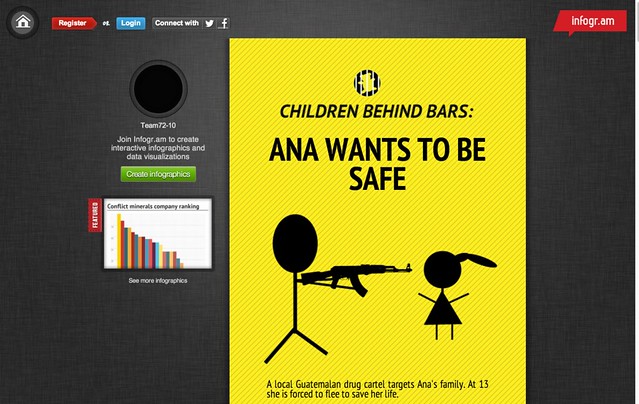
72-10
http://infogr.am/Ana-Just-Wants-To-Be-Safe/
Edie Rubinowitz, Adriana Gallardo, Brandon Huntz, Christopher Rudd & Fanny Sampson
This is an infographic story told on inogr.am that tells the story of children detained at the border.
Undocumented Immigrant Help Tool
This is a tool for people who are at high risk for deportation.

Gentrification Study
11square.net/migrahack
Seeks to compare gentrification patterns in Pilsen and Bucktown.